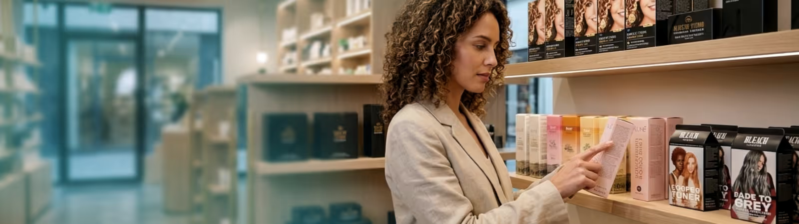
Research consistently shows that over 70% of purchase decisions are made at the point of sale — in the aisle, in front of the shelf, in under three seconds. Your packaging isn’t a container. It’s your sales team, brand ambassador, and closing argument, all folded into a single touchpoint. Understanding what drives those split-second decisions is the difference between a product that moves and one that gathers dust.
The consumer’s eye follows a predictable sequence: shape first, then color, then typography, and finally messaging. Brands that invert this order — leading with a tagline before establishing a visual identity — consistently underperform. Structural packaging design (the physical form of the carton) is the first signal, and it communicates quality, category, and price positioning before any print element is even processed.
Premium folding cartons with high-gloss UV coatings, soft-touch laminates, or metallic foil stamping trigger tactile and visual associations with quality that text alone cannot convey.
These are not decorative luxuries — they are functional purchase triggers.
Modern offset printing technology opens a spectrum of tactile and visual effects that directly influence purchase behavior:
Soft-Touch Lamination
Creates a matte, velvety surface that communicates premium positioning. Widely adopted in cosmetics and confectionery for its tactile premium signal.Drip-
Off Coatings
The contrast between gloss and matte on a single surface creates visual texture that draws the eye — effective on luxury goods and gifting lines.
Scented Lacquers
Multi-sensory packaging is the next frontier. Scented coatings applied during the print process create olfactory brand associations before the product is even opened.
Embossing & Debossing
Adds dimensionality to logos and key brand marks. When paired with optical registration technology, embossing can hit exact tolerances — creating razor-sharp definition on brand assets.
Foil Stamping
Metallic finishes — gold, silver, holographic — remain the most reliable premium signal in retail packaging. The reflective quality draws the eye at distance and holds attention at close range.
Color selection is not a creative preference — it is a strategic decision rooted in category convention and consumer psychology. Pharmaceutical packaging relies on clinical whites and clean blues to signal hygiene and trust. Confectionery uses warm reds, golds, and deep purples to evoke indulgence.
Cosmetics have bifurcated: mass-market brands default to pink and white, while premium brands increasingly use black, slate, and forest tones to signal exclusivity through contrast. The strategic opportunity lies in controlled deviation. A brand that understands its category’s color norms can break them deliberately — standing out precisely because every competitor is converging on the same visual language.
The box’s physical architecture communicates before the consumer touches it. Tuck-end cartons with a straight-tuck closure signal everyday utility. A reverse-tuck communicates mid-range. Suitcase-style locking boxes, magnetic closures, and sleeve-and-tray constructions signal premium. The structural design sets the price expectation before the price label is read — which means structural upgrades can enable price premiums that far exceed the manufacturing cost differential.


